Colors are not merely aesthetic; they are a universal language that directly influences the customer’s psyche. Choosing the right colors for corporate visual identities in the Middle East builds trust, evokes the right emotions, and drives purchasing decisions, setting your brand apart and making it memorable in a crowded market.
Why are colors crucial in visual identity design?
Colors are the first thing a customer notices about your brand and often shape their first impression. Therefore, they are a crucial element in any successful visual identity design. The right color can increase brand recognition by up to 80%. Furthermore, colors transcend words, conveying emotions and values quickly and effectively.
For example, blue can suggest trust and professionalism, while red evokes excitement and energy. Thus, the strategic choice of colors is not merely an artistic decision, but a business decision that directly influences how your audience perceives and remembers your brand.
How does color specifically influence Arab consumer behavior?
Arab consumer behavior is strongly influenced by the cultural and religious connotations of colors. Some colors carry deep meanings that may differ from their interpretations in Western cultures. For example, the color green is strongly associated with Islam, paradise, and prosperity, making it a positive choice for many brands in the region.
Conversely, other colors may carry negative connotations that should be avoided. Therefore, understanding these nuances is essential for building a strong connection with the audience. The impact of color on Arab consumer behavior is direct: the right color can build trust and encourage purchases, while the wrong color may alienate potential customers.
What are the common color connotations in the Middle East?
Understanding color meanings in the region is key to your brand’s success. Each color carries a different message that can influence purchasing decisions. Therefore, it is important to know these meanings when designing a professional logo or a complete brand identity.
Here are some common meanings:
- Green: Associated with nature, fertility, and religion. It is a very positive color that evokes peace and prosperity.
- White: Symbolizes purity, peace, and cleanliness. It is often used in the fields of healthcare and minimalism.
- Red: A powerful color representing love, energy, and passion. It can attract attention strongly but may also be associated with danger.
- Blue: Conveys trust, calmness, and professionalism. It is a popular choice for businesses and financial institutions.
- Gold and black: Symbolize luxury, wealth, and high quality. They are frequently used in luxury brands.
- Yellow: Can be confusing. While it represents happiness in some contexts, it may be associated with mourning in other countries, such as Egypt.
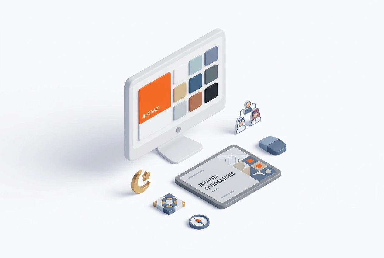
How do you choose the right color palette for your brand?
Choosing the right color palette requires a strategic approach. First, you must define your brand’s personality and the message you want to convey. Is your brand luxurious or friendly? Is it innovative or traditional? Answering these questions will help you determine your color direction.
Second, analyze your competitors. Knowing the colors they use can help you choose a palette that sets you apart from them. Finally, keep your target audience in mind. What appeals to young people may not appeal to older adults. At Boom Media, we use data and expertise to help our clients choose colors that deliver the best results.
What role does the color red play in branding in the Middle East?
Red plays a powerful and dual role in branding in the Middle East. On one hand, it is a color that strongly attracts attention and is associated with energy, love, and passion. Therefore, many brands in the food, beverage, and entertainment sectors use it to generate excitement and prompt immediate actions such as purchasing.
On the other hand, it must be used with caution. Red can also be associated with danger or warning. Consequently, its success depends on the context and how it is integrated into a company’s visual identity. Using it sparingly as an “accent color” can be very effective for grabbing attention without overwhelming the audience.
Is blue always a safe choice for corporate visual identity?
Blue is often considered a safe and reliable choice in corporate visual identity design around the world, including the Middle East. It conveys trust, calmness, and professionalism, making it ideal for companies in the technology, finance, and healthcare sectors. Furthermore, it is a universally loved color and rarely carries negative connotations.
However, being “safe” can also make it very common. This means your brand may struggle to stand out if it relies solely on blue. Therefore, it’s important to choose a unique shade of blue or combine it with a distinctive secondary color to create a memorable visual identity.
What about luxury colors like gold and black?
Gold and black are the cornerstones of luxury brand design in the Middle East. Black is associated with elegance, power, and sophistication, while gold adds a touch of wealth and exclusive quality. When combined, they create an undeniably strong sense of luxury.
Therefore, if your brand targets a high-end clientele, using these two colors is an excellent strategic choice. From luxury real estate to high-end jewelry, this color combination enhances the perceived value of the product and justifies higher prices. It creates a visual identity that attracts customers seeking exclusivity and quality.
How can you test the impact of colors before launching a visual identity?
Testing the impact of colors is a vital step to avoid costly mistakes. First, you can conduct A/B tests on digital designs. For example, you can create two versions of an ad or landing page with different colors and measure which one generates more engagement from the target audience.
Additionally, focus groups and surveys can be used to gather direct feedback from a sample of your audience. Show them logos or designs in different colors and ask them about the feelings and impressions they evoke. This qualitative data, combined with digital analytics, provides a comprehensive view and ensures that the final visual identity will resonate positively.
What are common mistakes in color selection for startups?
Startups face unique challenges and often fall into common pitfalls when choosing colors. One of the biggest mistakes is choosing based on the founder’s personal preference rather than data-driven research about the target audience. As a result, the visual identity may fail to connect with customers.
Another mistake is using too many colors, which makes the brand look unprofessional and scattered. Finally, ignoring the cultural connotations of colors in the target market—especially in a diverse region like the Middle East—can lead to misunderstandings and miscommunication. Partnering with experts like the Boom Media team can help avoid these mistakes.
Frequently Asked Questions
How do colors in visual identity influence purchasing decisions in Arab markets?
Colors have a direct impact on the Arab consumer’s psyche. Colors that evoke feelings of trust (blue), luxury (gold), or even appetite (red) can significantly influence purchasing decisions, especially when aligned with local cultural values.
What are the best colors for brands in Saudi Arabia?
The best colors depend on your industry. Generally, green (for growth and religion), blue (for trust and corporate identity), and gold and white (for luxury and purity) are strong and very popular choices in the Saudi market.
Why is a professional logo design important?
The logo is the face of your brand. A professional logo design ensures it is unique, memorable, and adaptable across all platforms. It builds credibility and shapes the first impression for customers.
Can Boom Media help me with visual identity design?
Yes, absolutely. At Boom Media, we have over 8 years of experience in building impactful brands. Our team is bilingual and certified as a Meta Business Partner, and we offer visual identity design services that deliver tangible results.
How long does it take to design a complete visual identity?
The duration varies depending on the project’s size and complexity. Generally, the process can take anywhere from a few weeks to two months and includes research, strategy development, design, revisions, and delivery of the final files.
Why is it important to update the visual identity of established companies?
Markets change, and so do customer expectations. Updating your visual identity helps your brand stay modern and relevant. It also shows that your company is evolving and keeping up with the times, which strengthens the trust of existing customers and attracts new ones.
Understanding color psychology isn’t just a nice-to-have—it’s a necessity for any brand’s success in the Middle East. At Boom Media, we combine creativity with data to build a strong visual identity that achieves your goals. Are you ready to make your brand stand out? Contact us today to explore how we can help you design a visual identity that attracts customers and drives growth. You can also follow our latest work on Facebook.